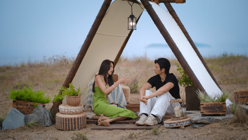
Why a UX Consultant & Designer is analyzing a dating show
If you’ve been watching Singles Inferno Season 5, you’ve probably had strong opinions about Choi Mina Sue’s choices. The internet certainly does.
But as a UX consultant, I watched her journey and kept thinking: This is exactly what we see in user research.
The gap between what people say they want and what they actually choose. The influence of social pressure on decision-making. When too many options lead to decision paralysis. The very human struggle of making choices under pressure.
Choi Mina Sue’s experience on Singles Inferno 5 is essentially a real-time case study in human behavior under constrained conditions, which is exactly what we study in UX research.
Let me break down what her decisions reveal about how people actually make choices, and why this matters for designers.
First, let’s acknowledge the real pressure
Before diving into the analysis, I want to say this: Choi Mina Sue is being real about struggles that most of us face. Hers just happens to be televised and under harsh public critique.
We’ve all struggled with:
- Not knowing what we really want until we’re forced to choose
- Being influenced by what others think
- Keeping our options open because commitment feels scary
- Making imperfect decisions under pressure
The difference is that most of us make these mistakes privately. Mina Sue’s every facial expression, every choice, every moment of uncertainty is broadcasted to millions and dissected online.
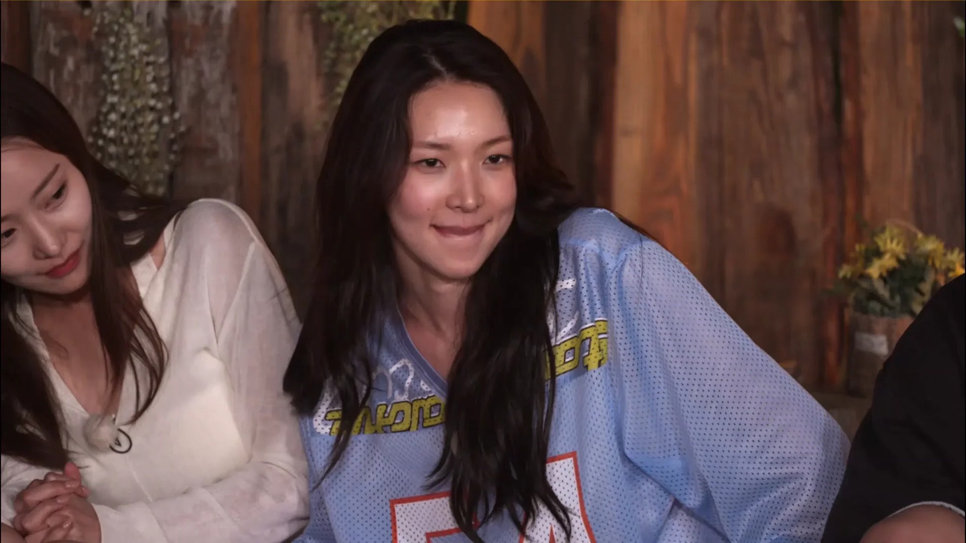
That takes a kind of vulnerability most people would never sign up for.
So while I’m analysing her behavior patterns from a UX perspective, I have genuine empathy for someone navigating high-stakes decisions in a fishbowl. That’s incredibly difficult.
That said, empathy doesn’t mean agreement with all behaviors. While I understand the pressure she’s under, some of her reactions crossed into contempt that’s hard to defend.
The eye-rolling, the exaggerated happiness and twirling when Seung-il chose her over Min-gee for a chat—these moments weren’t about her own confusion or struggle. They showed a lack of consideration for others’ feelings that goes beyond just “being unsure about what you want.”
You can be uncertain and overwhelmed without being unkind. That distinction matters.
With that context, let’s look at what her journey reveals about decision-making.
The Setup: Decision-Making Under Constraints
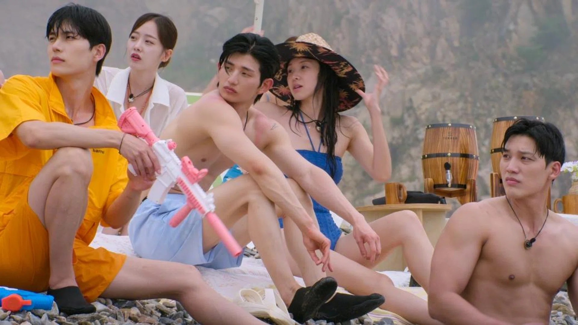
The Singles Inferno context:
- Limited time to make high-stakes decisions
- Incomplete information about options
- Social pressure from peers watching and judging
- Changing variables as new people enter or leave
- Emotions running high
- Public consequences for every choice
The UX parallel:
- Users making decisions with limited time or attention given
- Incomplete product information
- Social proof influencing choices (reviews, what friends use)
- Changing contexts and options
- Emotional stakes (money, privacy, status)
- Public visibility (social media sharing)
Sound familiar? This is literally the environment users operate in every day.
Observation 1: Stated Preferences vs. Revealed Preferences
What we heard Mina Sue say:
- She values emotional connection and deep conversation
- She wants someone genuine and sincere
- She’s looking for someone who matches her energy
- Physical attraction isn’t everything
What Mina’s choices revealed:
- Consistently chose options with higher social status or validation
- Gravitated toward men who were popular with other ladies
- Made decisions that kept her options open rather than committing
- Responded to confidence and assertiveness over emotional vulnerability
The UX lesson: People don’t know what they want, or won’t admit it
This is UX Research 101. When we ask users what they want in a product, they give us the “socially acceptable” answer:
- “I care about privacy” (then they accept all cookies without reading)
- “I want sustainable options” (then they choose the cheapest product)
- “I value quality over speed” (then they get frustrated waiting 3 seconds)
What people SAY ≠ What people DO
This isn’t about lying. Most people genuinely believe what they’re saying in the moment. Mina Sue probably does value emotional connection. But when faced with actual choices, other factors (status, validation, attraction) influenced her decisions more heavily.
This is human nature, not deception.
As UX advocates, we can’t just ask users what they want. We have to observe what they actually choose when given real options with real consequences.
The takeaway: Always validate stated preferences with behavioral data. Watch what users click, not what they say they’ll click.
Observation 2: Decision Paralysis from Too Many Options
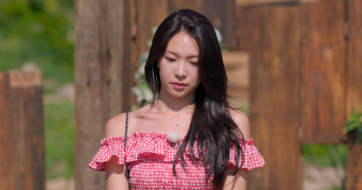
What happened with Mina:
- Multiple viable options presented at once
- Each new person added more complexity
- Rather than commit, she kept all options open
- This led to indecision and ultimately less satisfying outcomes
- She ended up stressed and overwhelmed
I get it. When you’re genuinely uncertain about what you want, keeping options open feels safer than making the “wrong” choice. The problem is that keeping all doors open means you never fully walk through any of them.
The UX parallel: The Paradox of Choice
Barry Schwartz’s research shows that more options often lead to:
- Decision paralysis
- Lower satisfaction with final choice
- Increased anxiety
- FOMO (fear of missing out)
We see this constantly in product design:
- E-commerce sites with 50 filter options leads to users abandoning search
- Streaming services with thousands of shows, resulting in “I can’t decide what to watch”
- Restaurant menus with 100+ items, leading to decision fatigue
- Dating apps with endless swipes ending up with commitment issues
Mina Sue’s behavior demonstrates what research proves: When you give people too many options without clear differentiation, they struggle to choose and often end up less happy.
The design solution:
- Reduce cognitive load through smart defaults
- Use progressive disclosure (reveal options gradually)
- Help users eliminate options, not just add them
- Provide clear comparison criteria
- Guide toward a decision rather than overwhelming with choice
Observation 3: Social Proof Overrides Personal Preference
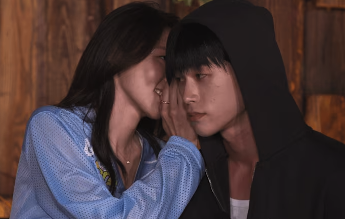
What we observed:
- Mina’s interest in certain people increased when others showed interest in them
- She became less interested in people who weren’t getting attention from others
- Group opinions influenced her individual assessment
- She sought validation for her choices from other contestants
- She even mentioned “I wish someone could just tell me what to do”
The UX principle: Social Proof is Powerful
Robert Cialdini identified social proof as one of the key principles of persuasion. People look to others’ behavior to determine their own, especially under uncertainty.
How this shows up in product design:
- “X people bought this item”
- “Trending now”
- “Your friends also use this”
- Star ratings and reviews
- Verified badges and endorsements by celebrities or public figures
But here’s what Mina’s experience reveals about the dark side:
Social proof can override authentic preference. She wasn’t necessarily choosing the “best” match for her, she was choosing the socially validated option.
Again, this is deeply human. When you’re uncertain about your own judgment, looking to what others value makes sense as a decision-making shortcut. The issue is when external validation completely replaces internal reflection.
The ethical design question: Are we helping users make better decisions, or just nudging them toward popular choices?
Design implications:
- Social proof should complement personal fit, not replace it
- Give users ways to express unique preferences
- Balance popularity signals with personalisation
- Be transparent about why you’re recommending something
Observation 4: The Sunk Cost Fallacy in Action
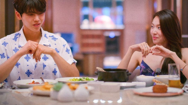
What we observed:
- Mina Sue continued investing in connections that weren’t working
- She stuck with early choices longer than optimal (ie. She couldn’t get over Su-been being her first Paradise date)
- “I’ve already spent this much time, I should keep trying”
- Difficulty pivoting even when new information suggested she should
The behavioral economics principle: Sunk Cost Fallacy
People continue investing in something because of what they’ve already invested, even when the rational choice is to cut losses and move on.
This one is particularly hard to watch because it’s so relatable. Who hasn’t stayed in a situation longer than they should because of the time and energy already spent? It’s not stupidity, it’s our brain trying to make past investments feel worthwhile.
How this shows up in products:
Subscription services know this:
- Free trial → you invest time setting it up → harder to cancel
- “You’ve already uploaded 500 photos” → switching cost feels high
- Progress bars and streaks → “I’ve already come this far…”
Social media exploits it:
- Years of posts and connections → “I can’t leave, my history is here”
- Follower counts → “I’ve built this audience”
Gaming uses it explicitly:
- “You’ve played 100 hours” → hard to abandon
- In-game purchases → sunk cost makes you keep playing
The UX insight: Mina’s behavior shows how powerful sunk costs are in decision-making. Once we’ve invested time, emotion, or effort, we become anchored to that choice, even when it’s clearly not working.
Ethical design consideration:
- Are we helping users make good ongoing decisions?
- Or trapping them with sunk costs?
- Do we make it easy to switch when something isn’t working?
What This Means for UX Designers & Consultants
The Singles Inferno environment is extreme, but the behavioral patterns are universal:
- People don’t know what they want until they’re making real choices with real consequences
- Design implication: Test with realistic stakes, not hypothetical scenarios
- Too many options without clear differentiation creates paralysis
- Design implication: Help users narrow down, don’t just present everything
- Social proof heavily influences individual preference
- Design implication: Use it responsibly; don’t let popularity override fit
- Sunk costs keep people in suboptimal choices
- Design implication: Make switching up or changing easier, not harder

The Broader Lesson: Design for Real Human Behavior
Watching Choi Mina Sue navigate Singles Inferno is fascinating not because she made “wrong” choices, but because her choices reveal how humans actually make decisions under pressure.
And she’s being remarkably real about it. Most people hide their confusion, their contradictions, their struggles with decision-making. Mina Sue is letting us see all of it, the uncertainty, the influence of others, the difficulty of knowing what you really want.
That’s brave, even when the execution isn’t always graceful.
As UX designers, we cannot design for the hypothetical rational, logical user who:
- Knows exactly what they want
- Carefully evaluates all options
- Makes decisions based purely on objective criteria
- Ignores social influence
- Is immune to sunk costs
We have to design for the real user who:
- Doesn’t know what they want until they see it
- Gets overwhelmed by too many options
- Is heavily influenced by what others do
- Struggles to let go of past investments
- Makes decisions based on emotion and heuristics
- Changes their mind based on incomplete information
Singles Inferno is just an accelerated, televised version of everyday decision-making.
The same principles apply whether someone is choosing a romantic partner or choosing which product to buy, which app to use, or which setting to enable.
A Note on Empathy vs. Agreement
Here’s something important for designers: Understanding behavior doesn’t mean endorsing it.
I understand why Mina Sue feels overwhelmed and acts in contradictory ways. The pressure is real, the confusion is legitimate and the struggle to know what you want is universal.
But understanding that doesn’t mean I agree with moments of contempt from her. The eye-rolling at others, the exaggerated display of happiness when someone chose her over another contestant. Those behaviours go beyond confusion and into disrespect.
This distinction matters in UX too:
- We can understand why users behave in certain ways (clicking “accept all cookies” because they’re tired or lack patience)
- While still designing against harmful patterns (making privacy-invasive choices the default)
- We can empathize with user struggles (decision fatigue)
- While still holding ourselves accountable for ethical design (not exploiting that fatigue)
Empathy is about understanding. Ethics is about what we do with that understanding.
My Final Thoughts
Next time you’re designing a user flow, ask yourself:
- Am I giving users too many options without helping them decide? (Choi Mina Sue paralysis)
- Am I relying on what users say they want vs. what they actually choose? (Stated vs. revealed preferences)
- Am I using social proof ethically? (Social influence)
- Am I making it easy to change course when needed? (Sunk cost traps)
- Am I designing with empathy while maintaining ethical standards? (Understanding ≠ endorsing)
Reality TV might seem like mindless entertainment. But if you watch with a designer’s eye, it’s a masterclass in human behavior under constrained conditions.
And understanding human behavior—not idealised behavior, but messy, contradictory, real behavior—is what makes great UX design.
Choi Mina Sue is showing us that messy reality. Some of it is relatable and human, while some of it crosses lines that deserve critique. Both can be true.
So yes, I analysed a dating show. But really I was analysing the same behavioral patterns I see in user research every single day.
What patterns have you noticed in how users make decisions? Drop your observations in the comments, I’m curious what other designers and consultants are seeing.
About This Blog
I’m Jade, a UX consultant and UI designer based in Singapore, writing about design strategy, user behavior, and what actually makes products work. Sometimes that means transforming digital products based on user research. Sometimes it means analysing Singles Inferno. It’s all human behavior.


Leave a Reply